Plotting
Introduction
Labeled data enables expressive computations. These samelabels can also be used to easily create informative plots.
xarray’s plotting capabilities are centered aroundxarray.DataArray objects.To plot xarray.Dataset objectssimply access the relevant DataArrays, ie dset['var1'].Here we focus mostly on arrays 2d or larger. If your data fitsnicely into a pandas DataFrame then you’re better off using one of the moredeveloped tools there.
xarray plotting functionality is a thin wrapper around the popularmatplotlib library.Matplotlib syntax and function names were copied as much as possible, whichmakes for an easy transition between the two.Matplotlib must be installed before xarray can plot.
To use xarray’s plotting capabilities with time coordinates containingcftime.datetime objectsnc-time-axis v1.2.0 or laterneeds to be installed.
For more extensive plotting applications consider the following projects:
Seaborn: “providesa high-level interface for drawing attractive statistical graphics.”Integrates well with pandas.
HoloViewsand GeoViews: “Composable, declarativedata structures for building even complex visualizations easily.” Includesnative support for xarray objects.
hvplot:
hvplotmakes it very easy to producedynamic plots (backed byHoloviewsorGeoviews) by adding ahvplotaccessor to DataArrays.Cartopy: Provides cartographictools.
Imports
The following imports are necessary for all of the examples.
- In [1]: import numpy as np
- In [2]: import pandas as pd
- In [3]: import matplotlib.pyplot as plt
- In [4]: import xarray as xr
For these examples we’ll use the North American air temperature dataset.
- In [5]: airtemps = xr.tutorial.open_dataset('air_temperature')
- In [6]: airtemps
- Out[6]:
- <xarray.Dataset>
- Dimensions: (lat: 25, lon: 53, time: 2920)
- Coordinates:
- * lat (lat) float32 75.0 72.5 70.0 67.5 65.0 ... 25.0 22.5 20.0 17.5 15.0
- * lon (lon) float32 200.0 202.5 205.0 207.5 ... 322.5 325.0 327.5 330.0
- * time (time) datetime64[ns] 2013-01-01 ... 2014-12-31T18:00:00
- Data variables:
- air (time, lat, lon) float32 ...
- Attributes:
- Conventions: COARDS
- title: 4x daily NMC reanalysis (1948)
- description: Data is from NMC initialized reanalysis\n(4x/day). These a...
- platform: Model
- references: http://www.esrl.noaa.gov/psd/data/gridded/data.ncep.reanaly...
- # Convert to celsius
- In [7]: air = airtemps.air - 273.15
- # copy attributes to get nice figure labels and change Kelvin to Celsius
- In [8]: air.attrs = airtemps.air.attrs
- In [9]: air.attrs['units'] = 'deg C'
Note
Until GH1614 is solved, you might need to copy over the metadata in attrs to get informative figure labels (as was done above).
One Dimension
Simple Example
The simplest way to make a plot is to call the xarray.DataArray.plot() method.
- In [10]: air1d = air.isel(lat=10, lon=10)
- In [11]: air1d.plot()
- Out[11]: [<matplotlib.lines.Line2D at 0x7f34243f3080>]
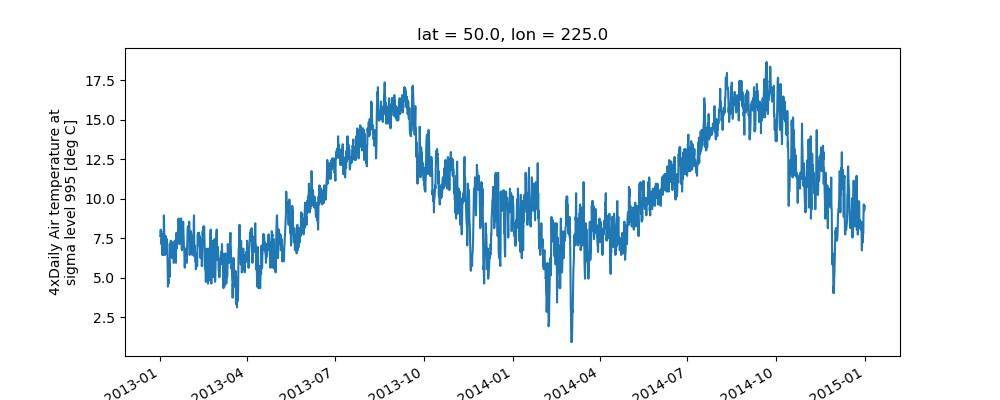 xarray uses the coordinate name along with metadata
 attrs.long_name, attrs.standard_name, DataArray.name and attrs.units (if available) to label the axes. The names long_name, standard_name and units are copied from the CF-conventions spec. When choosing names, the order of precedence is long_name, standard_name and finally DataArray.name. The y-axis label in the above plot was constructed from the long_name and units attributes of air1d.
- In [12]: air1d.attrs
- Out[12]:
- OrderedDict([('long_name', '4xDaily Air temperature at sigma level 995'),
- ('units', 'deg C'),
- ('precision', 2),
- ('GRIB_id', 11),
- ('GRIB_name', 'TMP'),
- ('var_desc', 'Air temperature'),
- ('dataset', 'NMC Reanalysis'),
- ('level_desc', 'Surface'),
- ('statistic', 'Individual Obs'),
- ('parent_stat', 'Other'),
- ('actual_range', array([185.16, 322.1 ], dtype=float32))])
Additional Arguments
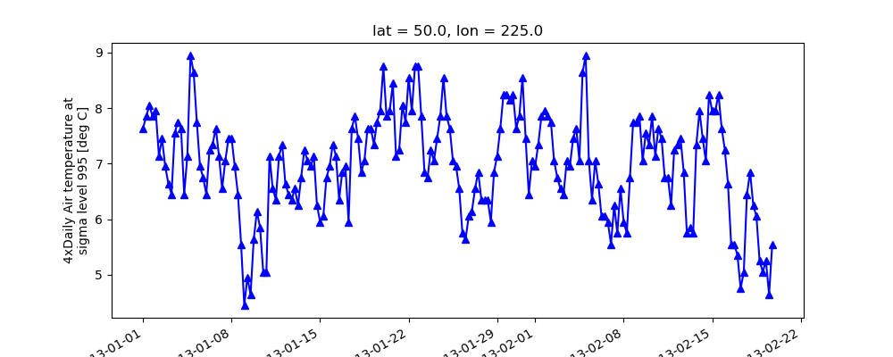
Additional arguments are passed directly to the matplotlib function whichdoes the work.For example, xarray.plot.line() callsmatplotlib.pyplot.plot passing in the index and the array values as x and y, respectively.So to make a line plot with blue triangles a matplotlib format stringcan be used:
- In [13]: air1d[:200].plot.line('b-^')
- Out[13]: [<matplotlib.lines.Line2D at 0x7f34252b1e48>]
Note
Not all xarray plotting methods support passing positional argumentsto the wrapped matplotlib functions, but they do allsupport keyword arguments.
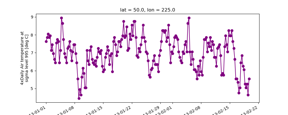
Keyword arguments work the same way, and are more explicit.
- In [14]: air1d[:200].plot.line(color='purple', marker='o')
- Out[14]: [<matplotlib.lines.Line2D at 0x7f3424fe5be0>]
Adding to Existing Axis
To add the plot to an existing axis pass in the axis as a keyword argumentax. This works for all xarray plotting methods.In this example axes is an array consisting of the left and rightaxes created by plt.subplots.
- In [15]: fig, axes = plt.subplots(ncols=2)
- In [16]: axes
- Out[16]:
- array([<matplotlib.axes._subplots.AxesSubplot object at 0x7f3424e57320>,
- <matplotlib.axes._subplots.AxesSubplot object at 0x7f3425425160>], dtype=object)
- In [17]: air1d.plot(ax=axes[0])
- Out[17]: [<matplotlib.lines.Line2D at 0x7f342513e400>]
- In [18]: air1d.plot.hist(ax=axes[1])
- Out[18]:
- (array([ 9., 38., 255., 584., 542., 489., 368., 258., 327., 50.]),
- array([ 0.95 , 2.719, 4.488, ..., 15.102, 16.871, 18.64 ], dtype=float32),
- <a list of 10 Patch objects>)
- In [19]: plt.tight_layout()
- In [20]: plt.draw()
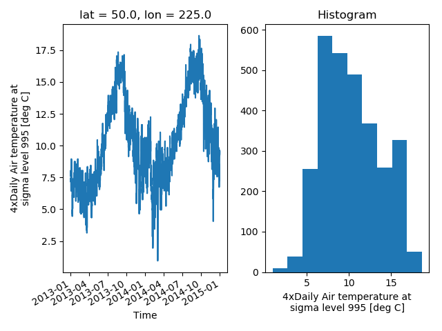 On the right is a histogram created by
 xarray.plot.hist().
Controlling the figure size
You can pass a figsize argument to all xarray’s plotting methods tocontrol the figure size. For convenience, xarray’s plotting methods alsosupport the aspect and size arguments which control the size of theresulting image via the formula figsize = (aspect * size, size):
- In [21]: air1d.plot(aspect=2, size=3)
- Out[21]: [<matplotlib.lines.Line2D at 0x7f342579aeb8>]
- In [22]: plt.tight_layout()
 This feature also works with Faceting. For facet plots,
size and aspect refer to a single panel (so that aspect * sizegives the width of each facet in inches), while figsize refers to theentire figure (as for matplotlib’s figsize argument).
Note
If figsize or size are used, a new figure is created,so this is mutually exclusive with the ax argument.
Note
The convention used by xarray (figsize = (aspect * size, size)) isborrowed from seaborn: it is therefore not equivalent to matplotlib’s.
Multiple lines showing variation along a dimension
It is possible to make line plots of two-dimensional data by calling xarray.plot.line()with appropriate arguments. Consider the 3D variable air defined above. We can use lineplots to check the variation of air temperature at three different latitudes along a longitude line:
- In [23]: air.isel(lon=10, lat=[19,21,22]).plot.line(x='time')
- Out[23]:
- [<matplotlib.lines.Line2D at 0x7f342572b710>,
- <matplotlib.lines.Line2D at 0x7f34257c3c50>,
- <matplotlib.lines.Line2D at 0x7f34257c3080>]
It is required to explicitly specify either
x: the dimension to be used for the x-axis, orhue: the dimension you want to represent by multiple lines.
Thus, we could have made the previous plot by specifying hue='lat' instead of x='time'.If required, the automatic legend can be turned off using addlegend=False. Alternatively,hue can be passed directly to xarray.plot() as _air.isel(lon=10, lat=[19,21,22]).plot(hue=’lat’).
Dimension along y-axis
It is also possible to make line plots such that the data are on the x-axis and a dimension is on the y-axis. This can be done by specifying the appropriate y keyword argument.
- In [24]: air.isel(time=10, lon=[10, 11]).plot(y='lat', hue='lon')
- Out[24]:
- [<matplotlib.lines.Line2D at 0x7f34258ab908>,
- <matplotlib.lines.Line2D at 0x7f34258abeb8>]
Step plots
As an alternative, also a step plot similar to matplotlib’s plt.step can bemade using 1D data.
- In [25]: air1d[:20].plot.step(where='mid')
- Out[25]: [<matplotlib.lines.Line2D at 0x7f3425811da0>]
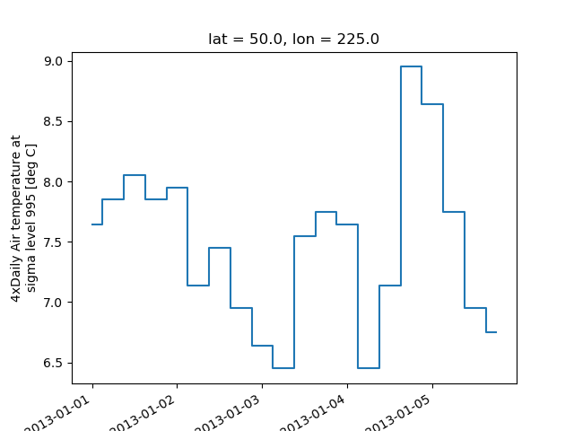 The argument
 where defines where the steps should be placed, options are'pre' (default), 'post', and 'mid'. This is particularly handywhen plotting data grouped with xarray.Dataset.groupby_bins().
- In [26]: air_grp = air.mean(['time','lon']).groupby_bins('lat',[0,23.5,66.5,90])
- In [27]: air_mean = air_grp.mean()
- In [28]: air_std = air_grp.std()
- In [29]: air_mean.plot.step()
- Out[29]: [<matplotlib.lines.Line2D at 0x7f342595f3c8>]
- In [30]: (air_mean + air_std).plot.step(ls=':')
- Out[30]: [<matplotlib.lines.Line2D at 0x7f34259b8ac8>]
- In [31]: (air_mean - air_std).plot.step(ls=':')
- Out[31]: [<matplotlib.lines.Line2D at 0x7f34259b82e8>]
- In [32]: plt.ylim(-20,30)
- Out[32]: (-20, 30)
- In [33]: plt.title('Zonal mean temperature')
- Out[33]: Text(0.5, 1.0, 'Zonal mean temperature')
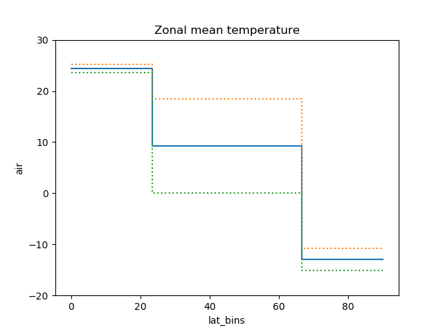 In this case, the actual boundaries of the bins are used and the
 where argumentis ignored.
Other axes kwargs
The keyword arguments xincrease and yincrease let you control the axes direction.
- In [34]: air.isel(time=10, lon=[10, 11]).plot.line(y='lat', hue='lon', xincrease=False, yincrease=False)
- Out[34]:
- [<matplotlib.lines.Line2D at 0x7f3425a2af98>,
- <matplotlib.lines.Line2D at 0x7f3425a2ac18>]
In addition, one can use xscale, yscale to set axes scaling; xticks, yticks to set axes ticks and xlim, ylim to set axes limits. These accept the same values as the matplotlib methods Axes.set(x,y)scale(), Axes.set(x,y)ticks(), Axes.set_(x,y)lim() respectively.
Two Dimensions
Simple Example
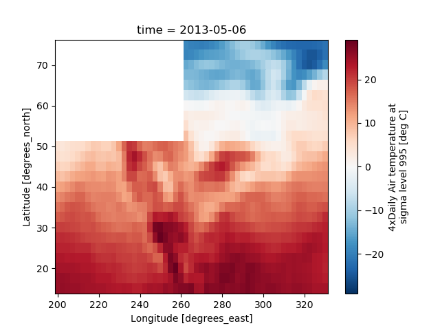
The default method xarray.DataArray.plot() calls xarray.plot.pcolormesh() by default when the data is two-dimensional.
- In [35]: air2d = air.isel(time=500)
- In [36]: air2d.plot()
- Out[36]: <matplotlib.collections.QuadMesh at 0x7f3424691f28>
 All 2d plots in xarray allow the use of the keyword arguments
 yincreaseand xincrease.
- In [37]: air2d.plot(yincrease=False)
- Out[37]: <matplotlib.collections.QuadMesh at 0x7f3425bd0080>
Note
We use xarray.plot.pcolormesh() as the default two-dimensional plotmethod because it is more flexible than xarray.plot.imshow().However, for large arrays, imshow can be much faster than pcolormesh.If speed is important to you and you are plotting a regular mesh, considerusing imshow.
Missing Values
xarray plots data with Missing values.
- In [38]: bad_air2d = air2d.copy()
- In [39]: bad_air2d[dict(lat=slice(0, 10), lon=slice(0, 25))] = np.nan
- In [40]: bad_air2d.plot()
- Out[40]: <matplotlib.collections.QuadMesh at 0x7f33f35b5cc0>
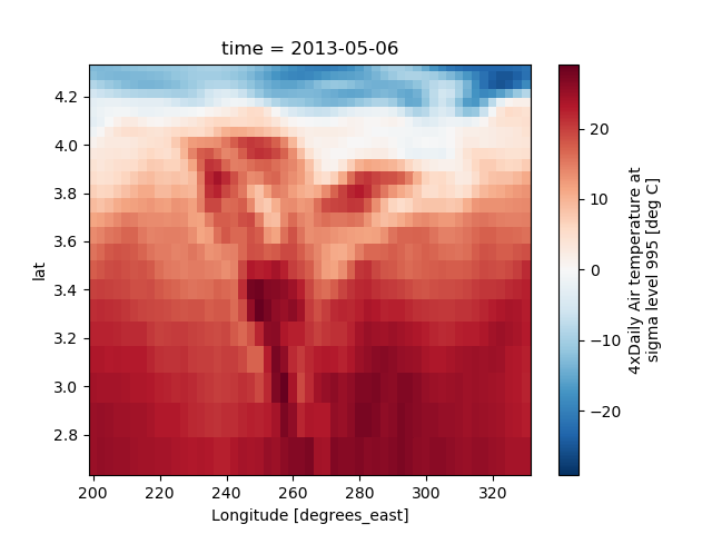
Nonuniform Coordinates
It’s not necessary for the coordinates to be evenly spaced. Bothxarray.plot.pcolormesh() (default) and xarray.plot.contourf() canproduce plots with nonuniform coordinates.
- In [41]: b = air2d.copy()
- # Apply a nonlinear transformation to one of the coords
- In [42]: b.coords['lat'] = np.log(b.coords['lat'])
- In [43]: b.plot()
- Out[43]: <matplotlib.collections.QuadMesh at 0x7f33f357e8d0>
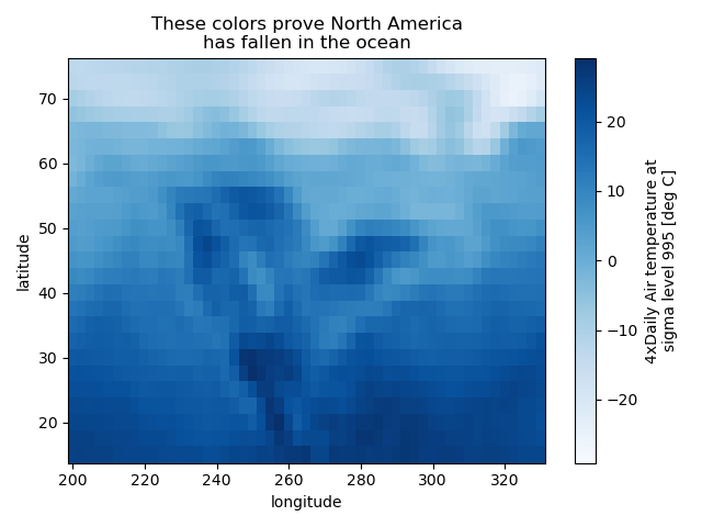
Calling Matplotlib
Since this is a thin wrapper around matplotlib, all the functionality ofmatplotlib is available.
- In [44]: air2d.plot(cmap=plt.cm.Blues)
- Out[44]: <matplotlib.collections.QuadMesh at 0x7f33f34db7f0>
- In [45]: plt.title('These colors prove North America\nhas fallen in the ocean')
- Out[45]: Text(0.5, 1.0, 'These colors prove North America\nhas fallen in the ocean')
- In [46]: plt.ylabel('latitude')
- Out[46]: Text(0, 0.5, 'latitude')
- In [47]: plt.xlabel('longitude')
- Out[47]: Text(0.5, 0, 'longitude')
- In [48]: plt.tight_layout()
- In [49]: plt.draw()
Note
xarray methods update label information and generally play around with theaxes. So any kind of updates to the plotshould be done after the call to the xarray’s plot.In the example below, plt.xlabel effectively does nothing, sinced_ylog.plot() updates the xlabel.
- In [50]: plt.xlabel('Never gonna see this.')
- Out[50]: Text(0.5, 0, 'Never gonna see this.')
- In [51]: air2d.plot()
- Out[51]: <matplotlib.collections.QuadMesh at 0x7f33f344a160>
- In [52]: plt.draw()

Colormaps
xarray borrows logic from Seaborn to infer what kind of color map to use. Forexample, consider the original data in Kelvins rather than Celsius:
- In [53]: airtemps.air.isel(time=0).plot()
- Out[53]: <matplotlib.collections.QuadMesh at 0x7f33f33cf358>
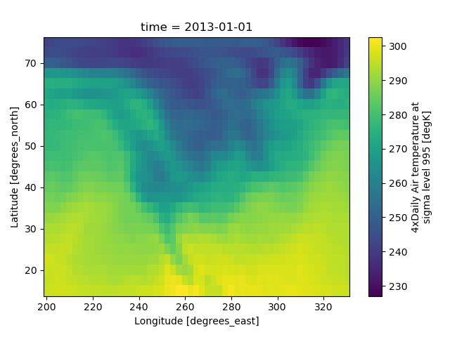 The Celsius data contain 0, so a diverging color map was used. TheKelvins do not have 0, so the default color map was used.
Robust
Outliers often have an extreme effect on the output of the plot.Here we add two bad data points. This affects the color scale,washing out the plot.
- In [54]: air_outliers = airtemps.air.isel(time=0).copy()
- In [55]: air_outliers[0, 0] = 100
- In [56]: air_outliers[-1, -1] = 400
- In [57]: air_outliers.plot()
- Out[57]: <matplotlib.collections.QuadMesh at 0x7f33f33a0ef0>
 This plot shows that we have outliers. The easy way to visualizethe data without the outliers is to pass the parameter
robust=True.This will use the 2nd and 98thpercentiles of the data to compute the color limits.
- In [58]: air_outliers.plot(robust=True)
- Out[58]: <matplotlib.collections.QuadMesh at 0x7f33f3383cc0>
 Observe that the ranges of the color bar have changed. The arrows on thecolor bar indicatethat the colors include data points outside the bounds.
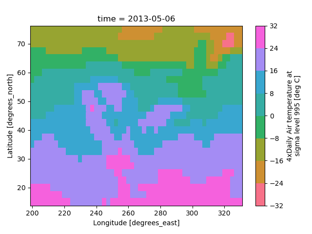
Discrete Colormaps
It is often useful, when visualizing 2d data, to use a discrete colormap,rather than the default continuous colormaps that matplotlib uses. Thelevels keyword argument can be used to generate plots with discretecolormaps. For example, to make a plot with 8 discrete color intervals:
- In [59]: air2d.plot(levels=8)
- Out[59]: <matplotlib.collections.QuadMesh at 0x7f33f32864a8>
 It is also possible to use a list of levels to specify the boundaries of thediscrete colormap:
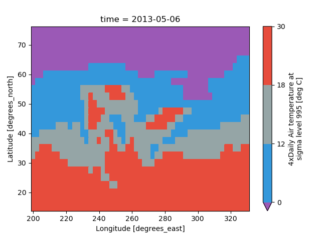
- In [60]: air2d.plot(levels=[0, 12, 18, 30])
- Out[60]: <matplotlib.collections.QuadMesh at 0x7f33f3267748>
 You can also specify a list of discrete colors through the
 colors argument:
- In [61]: flatui = ["#9b59b6", "#3498db", "#95a5a6", "#e74c3c", "#34495e", "#2ecc71"]
- In [62]: air2d.plot(levels=[0, 12, 18, 30], colors=flatui)
- Out[62]: <matplotlib.collections.QuadMesh at 0x7f33f323cc50>
 Finally, if you have Seaborninstalled, you can also specify a seaborn color palette to the
 cmapargument. Note that levels must be specified with seaborn color palettesif using imshow or pcolormesh (but not with contour or contourf,since levels are chosen automatically).
- In [63]: air2d.plot(levels=10, cmap='husl')
- Out[63]: <matplotlib.collections.QuadMesh at 0x7f33f31c1198>
- In [64]: plt.draw()
Faceting
Faceting here refers to splitting an array along one or two dimensions andplotting each group.xarray’s basic plotting is useful for plotting two dimensional arrays. Whatabout three or four dimensional arrays? That’s where facets become helpful.
Consider the temperature data set. There are 4 observations per day for twoyears which makes for 2920 values along the time dimension.One way to visualize this data is to make aseparate plot for each time period.
The faceted dimension should not have too many values;faceting on the time dimension will produce 2920 plots. That’stoo much to be helpful. To handle this situation try performingan operation that reduces the size of the data in some way. For example, wecould compute the average air temperature for each month and reduce thesize of this dimension from 2920 -> 12. A simpler way isto just take a slice on that dimension.So let’s use a slice to pick 6 times throughout the first year.
- In [65]: t = air.isel(time=slice(0, 365 * 4, 250))
- In [66]: t.coords
- Out[66]:
- Coordinates:
- * lat (lat) float32 75.0 72.5 70.0 67.5 65.0 ... 25.0 22.5 20.0 17.5 15.0
- * lon (lon) float32 200.0 202.5 205.0 207.5 ... 322.5 325.0 327.5 330.0
- * time (time) datetime64[ns] 2013-01-01 ... 2013-11-09T12:00:00
Simple Example
The easiest way to create faceted plots is to pass in row or colarguments to the xarray plotting methods/functions. This returns axarray.plot.FacetGrid object.
- In [67]: g_simple = t.plot(x='lon', y='lat', col='time', col_wrap=3)
Faceting also works for line plots.
- In [68]: g_simple_line = t.isel(lat=slice(0,None,4)).plot(x='lon', hue='lat', col='time', col_wrap=3)
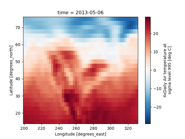
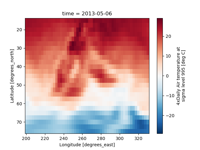
4 dimensional
For 4 dimensional arrays we can use the rows and columns of the grids.Here we create a 4 dimensional array by taking the original data and addinga fixed amount. Now we can see how the temperature maps would compare ifone were much hotter.
- In [69]: t2 = t.isel(time=slice(0, 2))
- In [70]: t4d = xr.concat([t2, t2 + 40], pd.Index(['normal', 'hot'], name='fourth_dim'))
- # This is a 4d array
- In [71]: t4d.coords
- Out[71]:
- Coordinates:
- * lat (lat) float32 75.0 72.5 70.0 67.5 65.0 ... 22.5 20.0 17.5 15.0
- * lon (lon) float32 200.0 202.5 205.0 207.5 ... 325.0 327.5 330.0
- * time (time) datetime64[ns] 2013-01-01 2013-03-04T12:00:00
- * fourth_dim (fourth_dim) object 'normal' 'hot'
- In [72]: t4d.plot(x='lon', y='lat', col='time', row='fourth_dim')
- Out[72]: <xarray.plot.facetgrid.FacetGrid at 0x7f33f302c128>
Other features
Faceted plotting supports other arguments common to xarray 2d plots.
- In [73]: hasoutliers = t.isel(time=slice(0, 5)).copy()
- In [74]: hasoutliers[0, 0, 0] = -100
- In [75]: hasoutliers[-1, -1, -1] = 400
- In [76]: g = hasoutliers.plot.pcolormesh('lon', 'lat', col='time', col_wrap=3,
- ....: robust=True, cmap='viridis',
- ....: cbar_kwargs={'label': 'this has outliers'})
- ....:
FacetGrid Objects
xarray.plot.FacetGrid is used to control the behavior of themultiple plots.It borrows an API and code from Seaborn’s FacetGrid.The structure is contained within the axes and name_dictsattributes, both 2d Numpy object arrays.
- In [77]: g.axes
- Out[77]:
- array([[<matplotlib.axes._subplots.AxesSubplot object at 0x7f33f2dad358>,
- <matplotlib.axes._subplots.AxesSubplot object at 0x7f33f2d554a8>,
- <matplotlib.axes._subplots.AxesSubplot object at 0x7f33f2d7e438>],
- [<matplotlib.axes._subplots.AxesSubplot object at 0x7f33f2d2a3c8>,
- <matplotlib.axes._subplots.AxesSubplot object at 0x7f33f2cd3358>,
- <matplotlib.axes._subplots.AxesSubplot object at 0x7f33f2cff2e8>]], dtype=object)
- In [78]: g.name_dicts
- Out[78]:
- array([[{'time': numpy.datetime64('2013-01-01T00:00:00.000000000')},
- {'time': numpy.datetime64('2013-03-04T12:00:00.000000000')},
- {'time': numpy.datetime64('2013-05-06T00:00:00.000000000')}],
- [{'time': numpy.datetime64('2013-07-07T12:00:00.000000000')},
- {'time': numpy.datetime64('2013-09-08T00:00:00.000000000')}, None]], dtype=object)
It’s possible to select the xarray.DataArray orxarray.Dataset corresponding to the FacetGrid through thename_dicts.
- In [79]: g.data.loc[g.name_dicts[0, 0]]
- Out[79]:
- <xarray.DataArray 'air' (lat: 25, lon: 53)>
- array([[-100. , -30.649994, -29.649994, ..., -40.350006, -37.649994,
- -34.550003],
- [ -29.350006, -28.649994, -28.449997, ..., -40.350006, -37.850006,
- -33.850006],
- [ -23.149994, -23.350006, -24.259995, ..., -39.949997, -36.759995,
- -31.449997],
- ...,
- [ 23.450012, 23.049988, 23.25 , ..., 22.25 , 21.950012,
- 21.549988],
- [ 22.75 , 23.049988, 23.640015, ..., 22.75 , 22.75 ,
- 22.049988],
- [ 23.140015, 23.640015, 23.950012, ..., 23.75 , 23.640015,
- 23.450012]], dtype=float32)
- Coordinates:
- * lat (lat) float64 75.0 72.5 70.0 67.5 65.0 ... 25.0 22.5 20.0 17.5 15.0
- * lon (lon) float64 200.0 202.5 205.0 207.5 ... 322.5 325.0 327.5 330.0
- time datetime64[ns] 2013-01-01
- Attributes:
- long_name: 4xDaily Air temperature at sigma level 995
- units: deg C
- precision: 2
- GRIB_id: 11
- GRIB_name: TMP
- var_desc: Air temperature
- dataset: NMC Reanalysis
- level_desc: Surface
- statistic: Individual Obs
- parent_stat: Other
- actual_range: [185.16 322.1 ]
Here is an example of using the lower level API and then modifying the axes afterthey have been plotted.
- In [80]: g = t.plot.imshow('lon', 'lat', col='time', col_wrap=3, robust=True)
- In [81]: for i, ax in enumerate(g.axes.flat):
- ....: ax.set_title('Air Temperature %d' % i)
- ....:
- In [82]: bottomright = g.axes[-1, -1]
- In [83]: bottomright.annotate('bottom right', (240, 40))
- Out[83]: Text(240, 40, 'bottom right')
- In [84]: plt.draw()
TODO: add an example of using the map method to plot dataset variables(e.g., with plt.quiver).
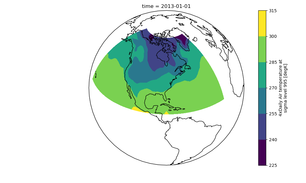
Maps
To follow this section you’ll need to have Cartopy installed and working.
This script will plot the air temperature on a map.
- In [85]: import cartopy.crs as ccrs
- In [86]: air = xr.tutorial.open_dataset('air_temperature').air
- In [87]: ax = plt.axes(projection=ccrs.Orthographic(-80, 35))
- In [88]: air.isel(time=0).plot.contourf(ax=ax, transform=ccrs.PlateCarree());
- In [89]: ax.set_global(); ax.coastlines();
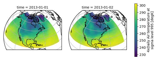
 When faceting on maps, the projection can be transferred to the
 plotfunction using the subplot_kws keyword. The axes for the subplots createdby faceting are accessible in the object returned by plot:
- In [90]: p = air.isel(time=[0, 4]).plot(transform=ccrs.PlateCarree(), col='time',
- ....: subplot_kws={'projection': ccrs.Orthographic(-80, 35)})
- ....:
- In [91]: for ax in p.axes.flat:
- ....: ax.coastlines()
- ....: ax.gridlines()
- ....:
- In [92]: plt.draw();
Details
Ways to Use
There are three ways to use the xarray plotting functionality:
Use
plotas a convenience method for a DataArray.Access a specific plotting method from the
plotattribute of aDataArray.Directly from the xarray plot submodule.
These are provided for user convenience; they all call the same code.
- In [93]: import xarray.plot as xplt
- In [94]: da = xr.DataArray(range(5))
- In [95]: fig, axes = plt.subplots(ncols=2, nrows=2)
- In [96]: da.plot(ax=axes[0, 0])
- Out[96]: [<matplotlib.lines.Line2D at 0x7f34246854e0>]
- In [97]: da.plot.line(ax=axes[0, 1])
- Out[97]: [<matplotlib.lines.Line2D at 0x7f33f2f1d0b8>]
- In [98]: xplt.plot(da, ax=axes[1, 0])
- Out[98]: [<matplotlib.lines.Line2D at 0x7f3424685d68>]
- In [99]: xplt.line(da, ax=axes[1, 1])
- Out[99]: [<matplotlib.lines.Line2D at 0x7f34257d9860>]
- In [100]: plt.tight_layout()
- In [101]: plt.draw()
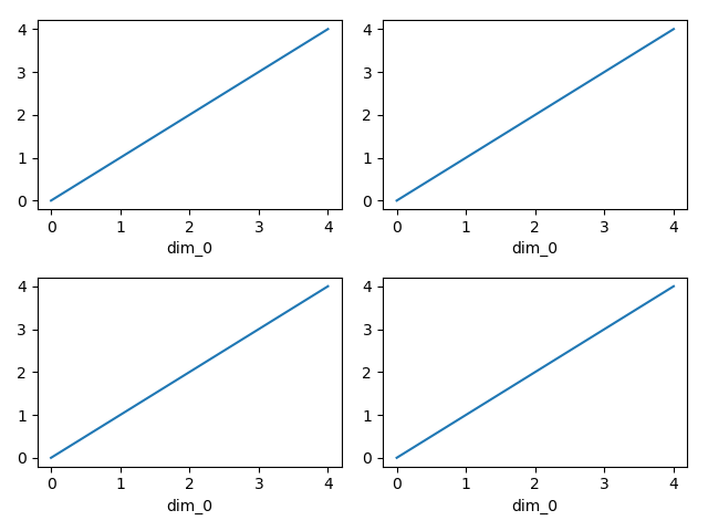 Here the output is the same. Since the data is 1 dimensional the line plotwas used.
The convenience method xarray.DataArray.plot() dispatches to an appropriateplotting function based on the dimensions of the DataArray and whetherthe coordinates are sorted and uniformly spaced. This tabledescribes what gets plotted:
| Dimensions | Plotting function |
| 1 | xarray.plot.line() |
| 2 | xarray.plot.pcolormesh() |
| Anything else | xarray.plot.hist() |
Coordinates
If you’d like to find out what’s really going on in the coordinate system,read on.
- In [102]: a0 = xr.DataArray(np.zeros((4, 3, 2)), dims=('y', 'x', 'z'),
- .....: name='temperature')
- .....:
- In [103]: a0[0, 0, 0] = 1
- In [104]: a = a0.isel(z=0)
- In [105]: a
- Out[105]:
- <xarray.DataArray 'temperature' (y: 4, x: 3)>
- array([[1., 0., 0.],
- [0., 0., 0.],
- [0., 0., 0.],
- [0., 0., 0.]])
- Dimensions without coordinates: y, x
The plot will produce an image corresponding to the values of the array.Hence the top left pixel will be a different color than the others.Before reading on, you may want to look at the coordinates andthink carefully about what the limits, labels, and orientation foreach of the axes should be.
- In [106]: a.plot()
- Out[106]: <matplotlib.collections.QuadMesh at 0x7f33f29d9e48>
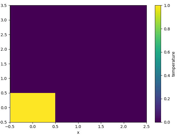 It may seem strange thatthe values on the y axis are decreasing with -0.5 on the top. This is becausethe pixels are centered over their coordinates, and theaxis labels and ranges correspond to the values of thecoordinates.
Multidimensional coordinates
See also: Working with Multidimensional Coordinates.
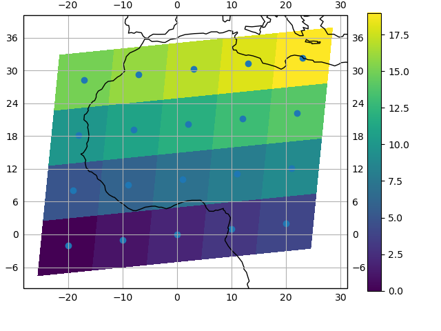
You can plot irregular grids defined by multidimensional coordinates withxarray, but you’ll have to tell the plot function to use these coordinatesinstead of the default ones:
- In [107]: lon, lat = np.meshgrid(np.linspace(-20, 20, 5), np.linspace(0, 30, 4))
- In [108]: lon += lat/10
- In [109]: lat += lon/10
- In [110]: da = xr.DataArray(np.arange(20).reshape(4, 5), dims=['y', 'x'],
- .....: coords = {'lat': (('y', 'x'), lat),
- .....: 'lon': (('y', 'x'), lon)})
- .....:
- In [111]: da.plot.pcolormesh('lon', 'lat');
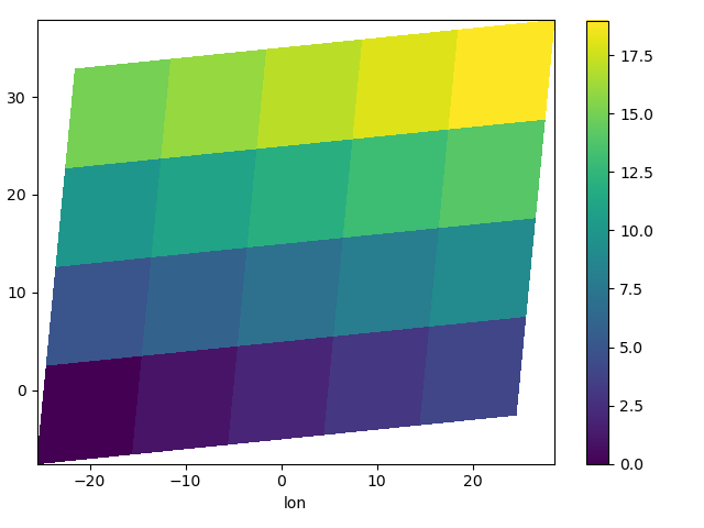 Note that in this case, xarray still follows the pixel centered convention.This might be undesirable in some cases, for example when your data is definedon a polar projection (GH781). This is why the default is to not followthis convention when plotting on a map:
- In [112]: import cartopy.crs as ccrs
- In [113]: ax = plt.subplot(projection=ccrs.PlateCarree());
- In [114]: da.plot.pcolormesh('lon', 'lat', ax=ax);
- In [115]: ax.scatter(lon, lat, transform=ccrs.PlateCarree());
- In [116]: ax.coastlines(); ax.gridlines(draw_labels=True);
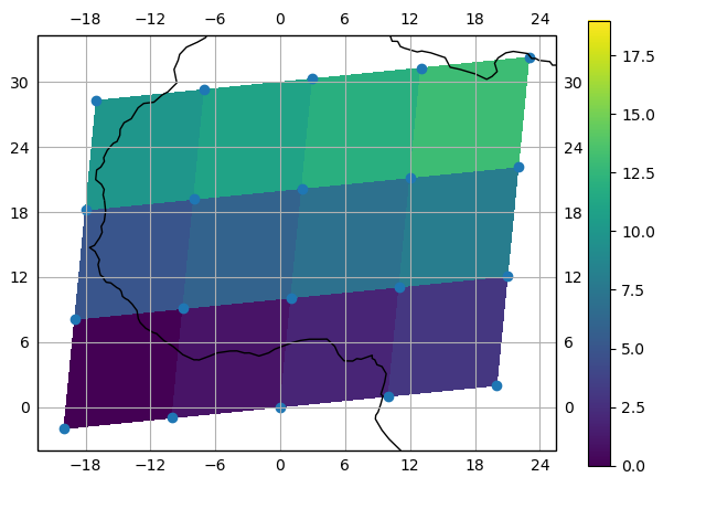 You can however decide to infer the cell boundaries and use the
infer_intervals keyword:
- In [117]: ax = plt.subplot(projection=ccrs.PlateCarree());
- In [118]: da.plot.pcolormesh('lon', 'lat', ax=ax, infer_intervals=True);
- In [119]: ax.scatter(lon, lat, transform=ccrs.PlateCarree());
- In [120]: ax.coastlines(); ax.gridlines(draw_labels=True);
Note
The data model of xarray does not support datasets with cell boundariesyet. If you want to use these coordinates, you’ll have to make the plotsoutside the xarray framework.
One can also make line plots with multidimensional coordinates. In this case, hue must be a dimension name, not a coordinate name.
- In [121]: f, ax = plt.subplots(2, 1)
- In [122]: da.plot.line(x='lon', hue='y', ax=ax[0]);
- In [123]: da.plot.line(x='lon', hue='x', ax=ax[1]);